
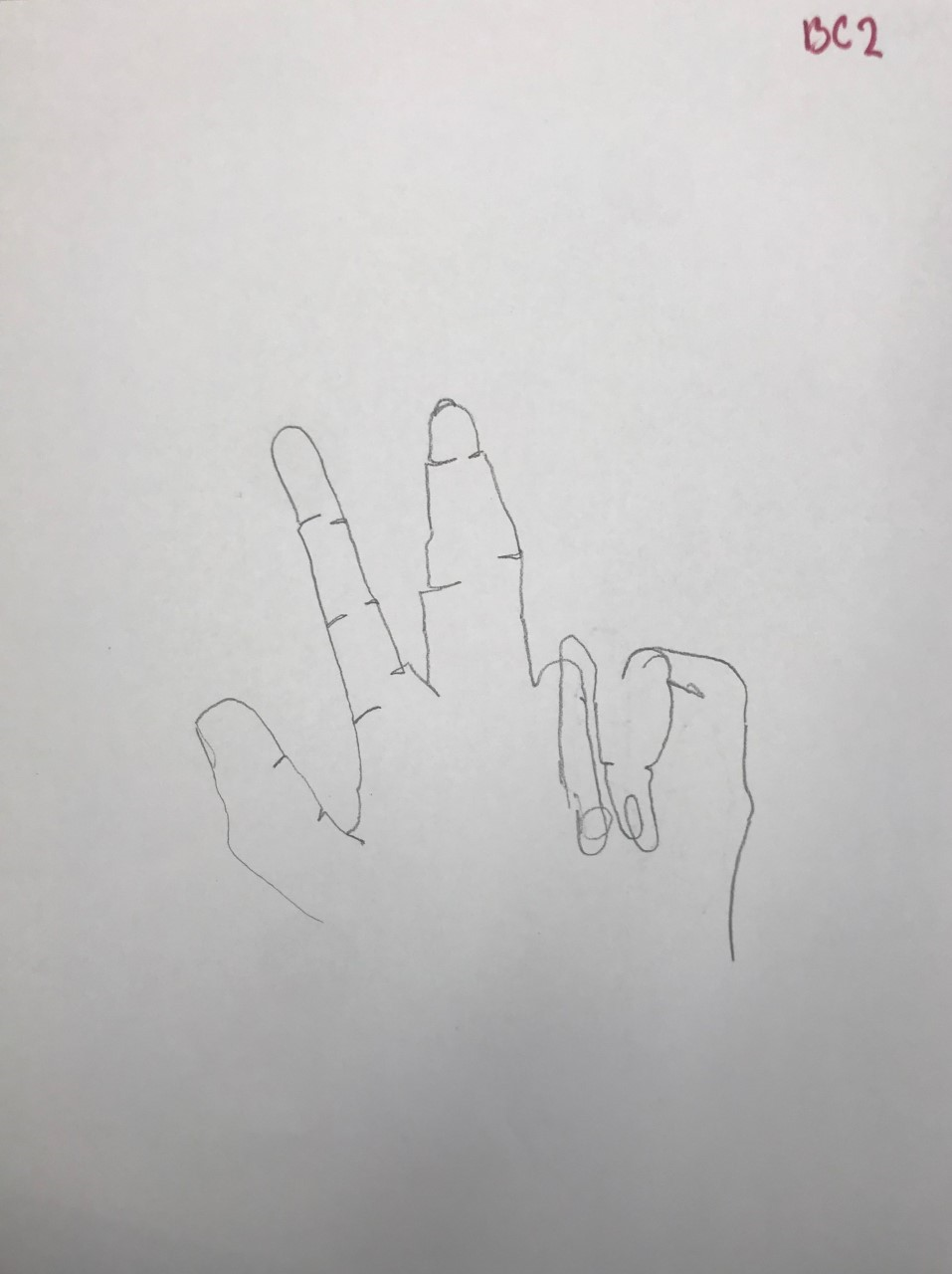
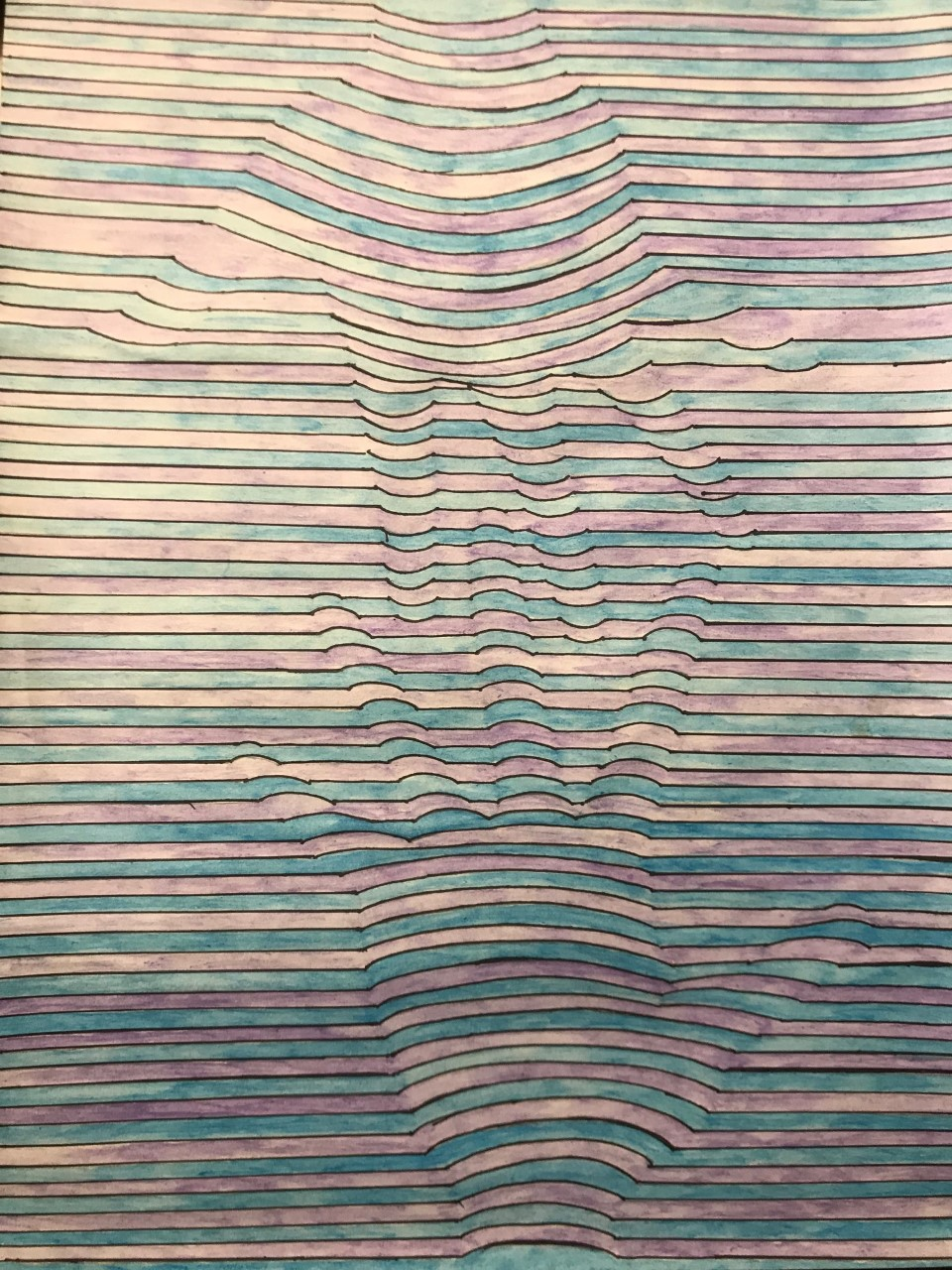
I wasn't inspired by a specific artist I've seen this kind of artwork online. So knowing that this was a cross contour, I decided to try it. The media I used was watercolors, I wanted it bright and very pigmented. To be honest at the beginning I chose hands because it was all I could think of, but then I put more thought into it and came up with a story with it. To me it looks to me a couple or a pair of friends in the processes of intertwining hands which gave me more depth into the artwork. my artwork was made for you to look at it and think for a second and figure out what it is. I purposely made the hands not noticeable at first but once you saw it, you can't not see it. Making the lines repeatedly the same size helped make some kind of an illusion.


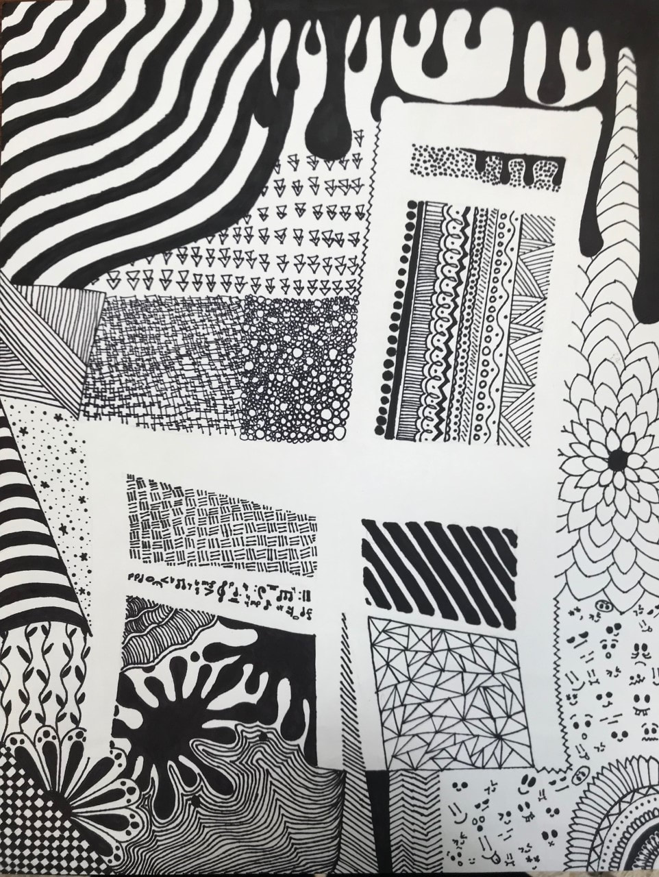
For my final assignment in the negative shape unit, I chose a simple chair as my subject because there was a lot of space around it to use and cover. I chose permanent marker as my medium because it was simple and wouldn't take away from the designs, you would see the designs rather then the color. The way in which I chose to make this piece show my artistic voice was by making it completely random, nothing specifically from anywhere. I feel I was most successful with taking up the space with patterns and not leaving a lot of empty space. If I were to do this again, I might consider having a better idea about patterns before going into it so it wouldn't take as long to create.
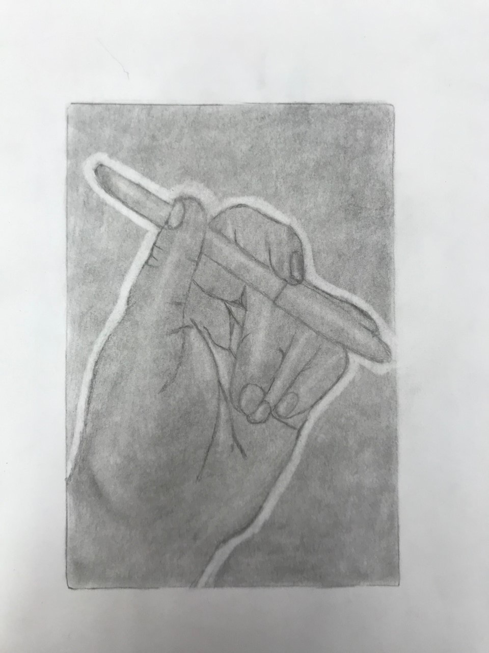
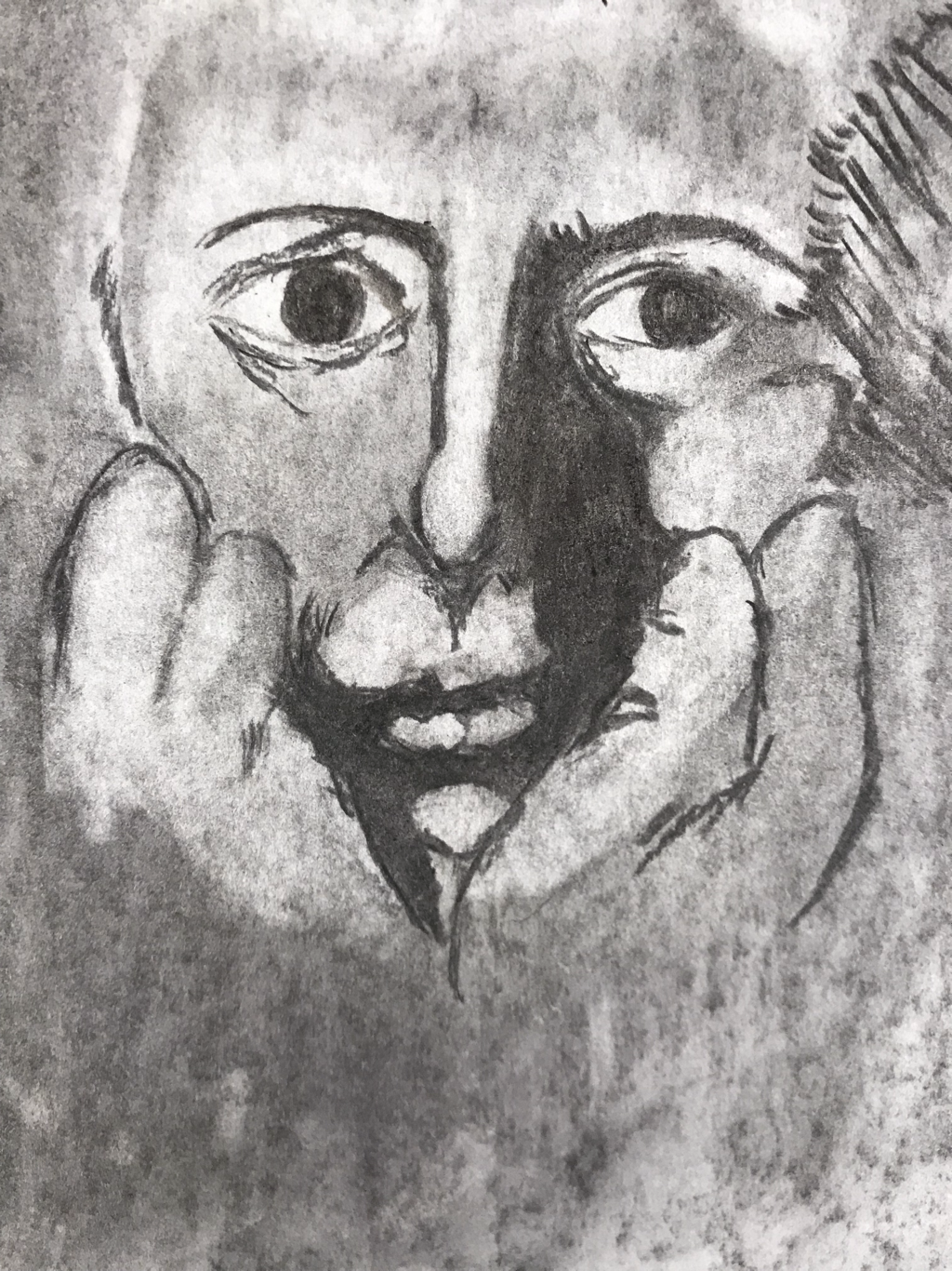
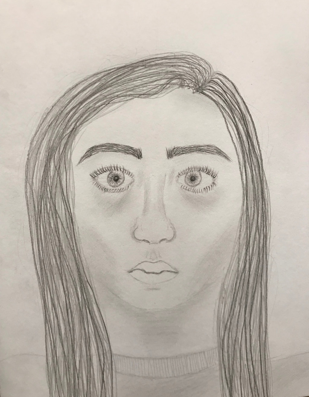
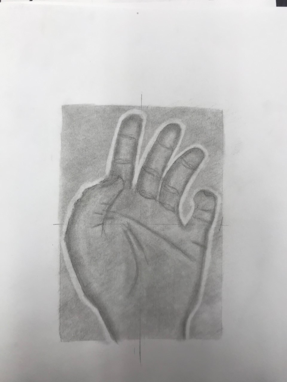
Second Hand
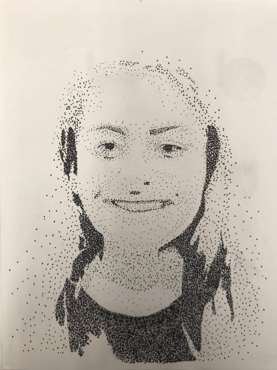
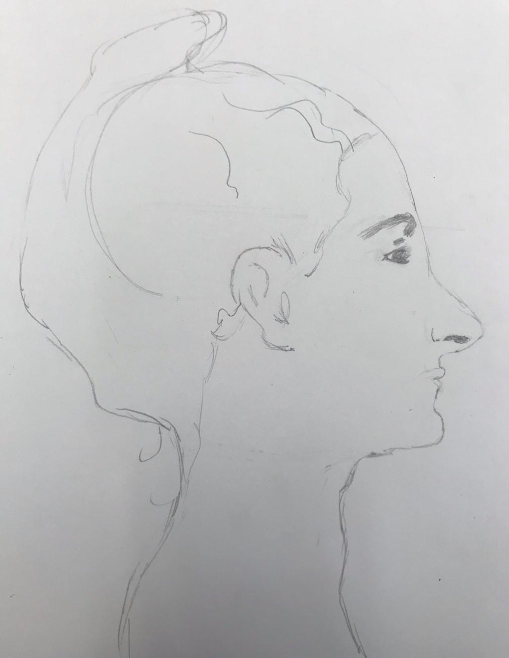
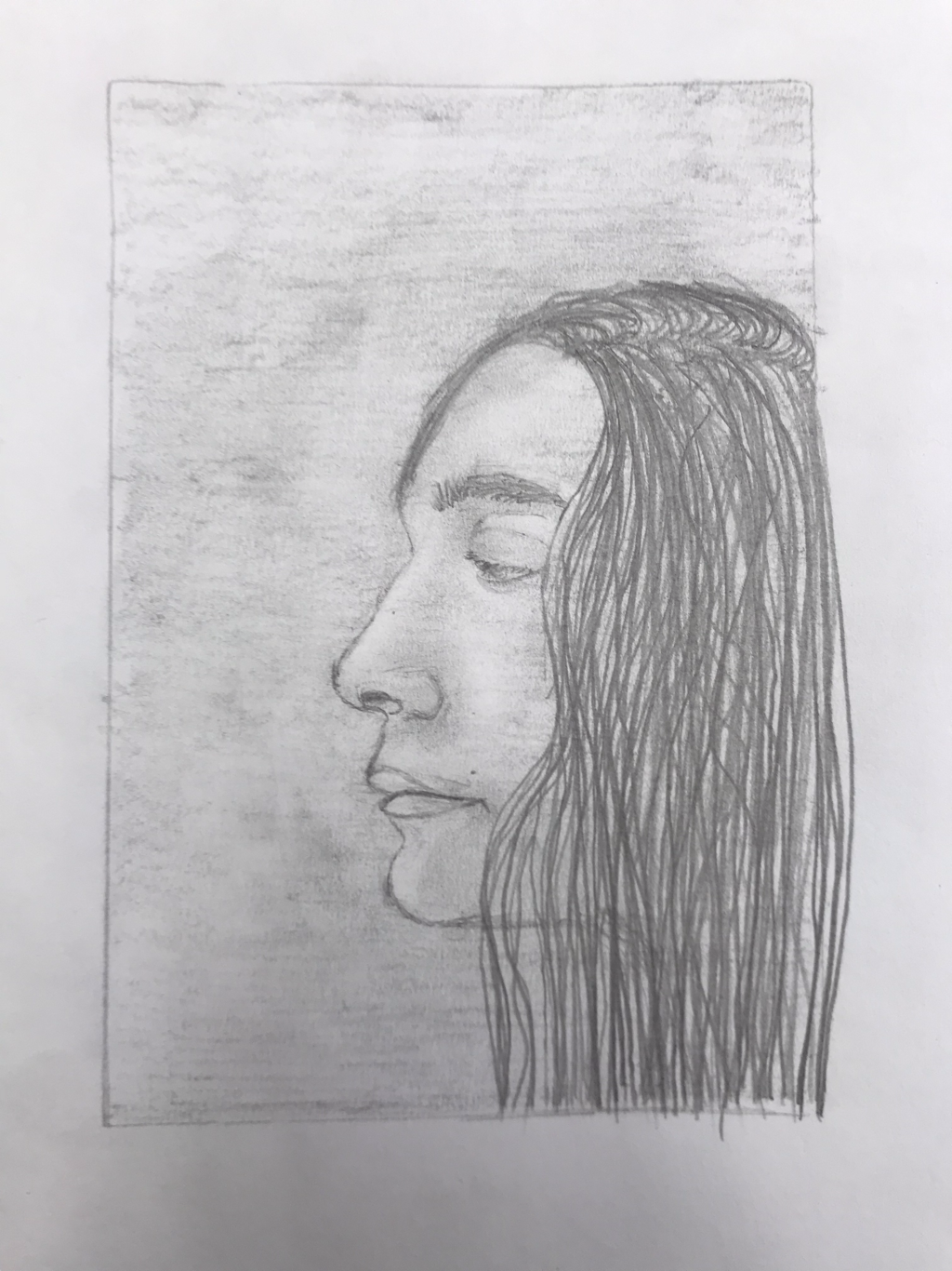
First hand
I think my second hand looked better and more three dimensional. Although it was still dark and there wasn't a broad spectrum of light and dark. I think both hands did not have a bold outline. I can kinda identify all of them but there are not prominent.
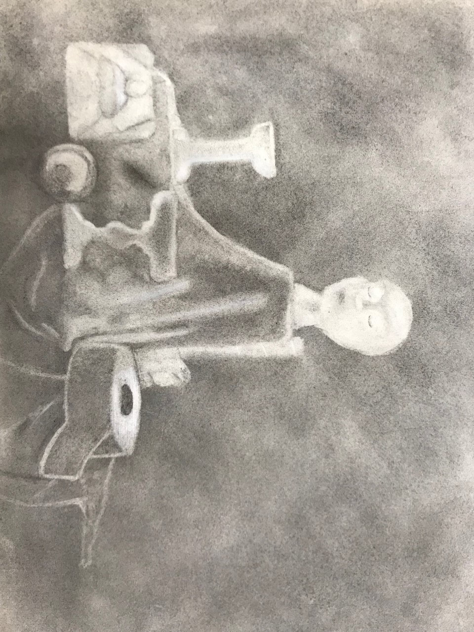
Charcoal, I need to be patient and be careful where I set my hand so I don’t smudge anything. I most pleased with my second hand drawing because I feel I looks the most developed, 3D, and detailed.
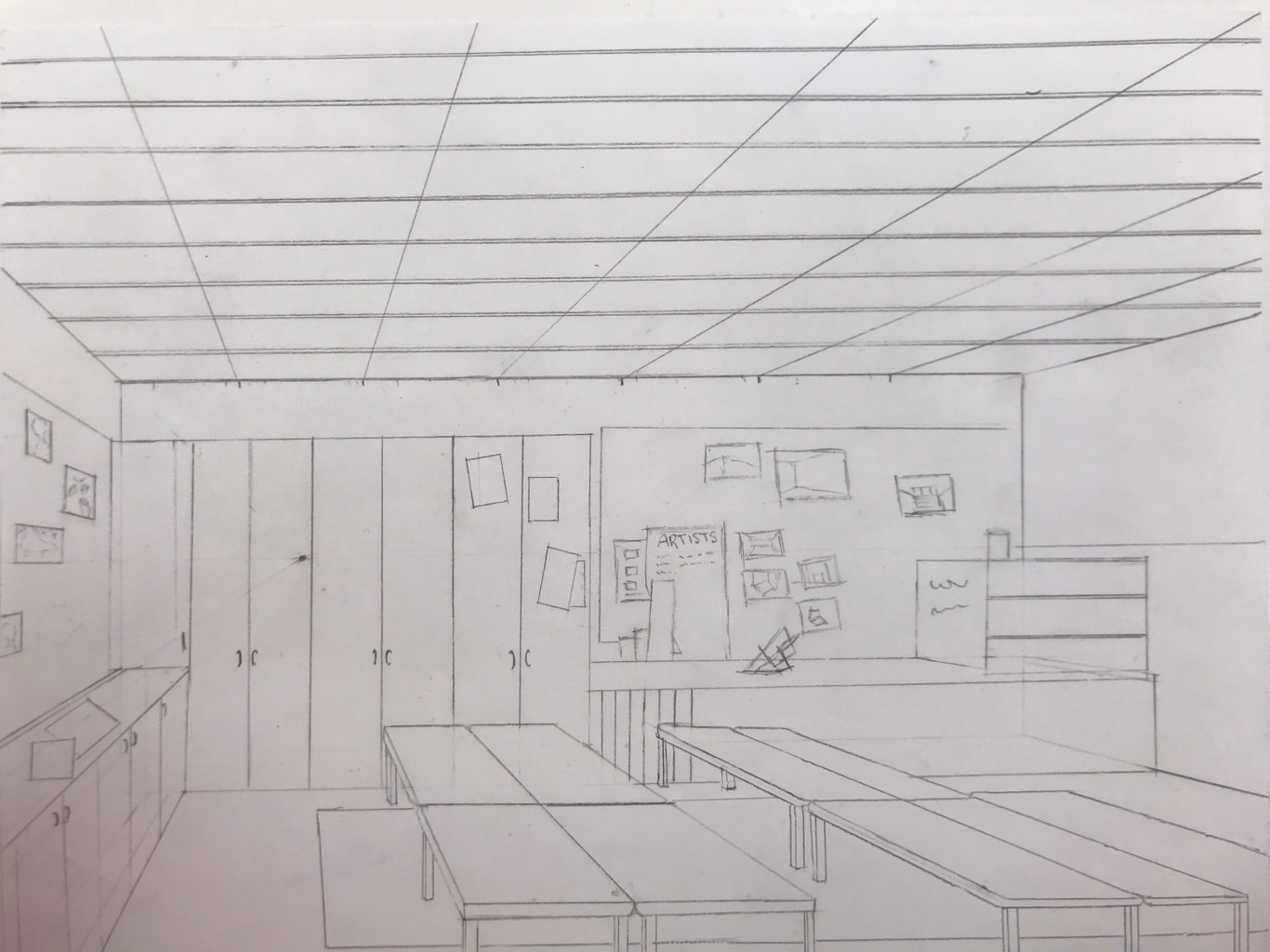
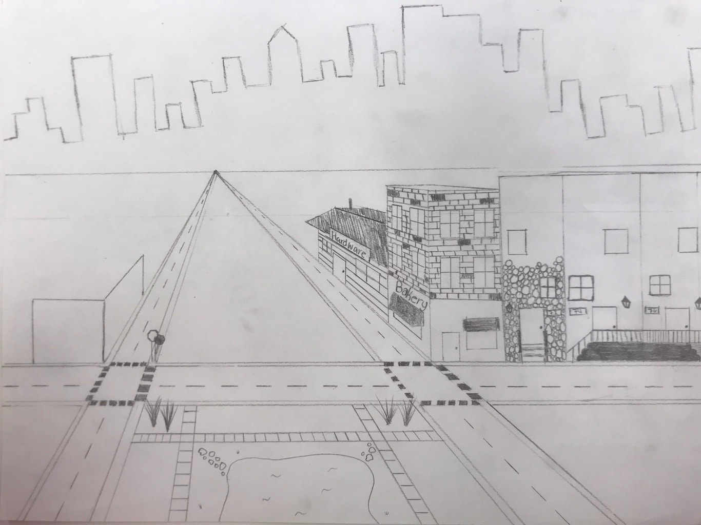
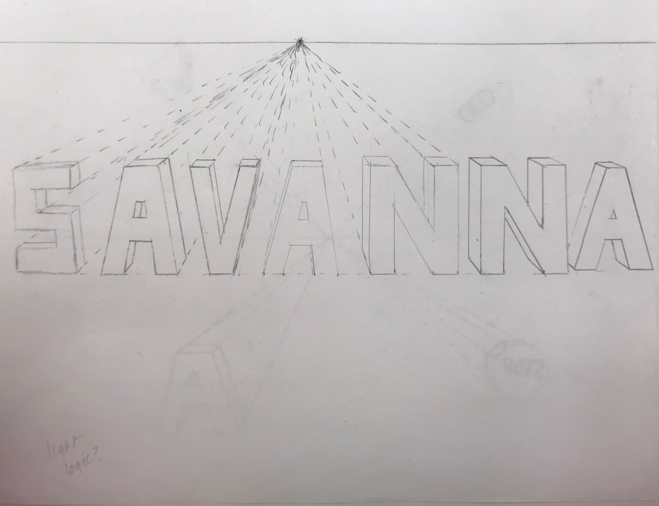
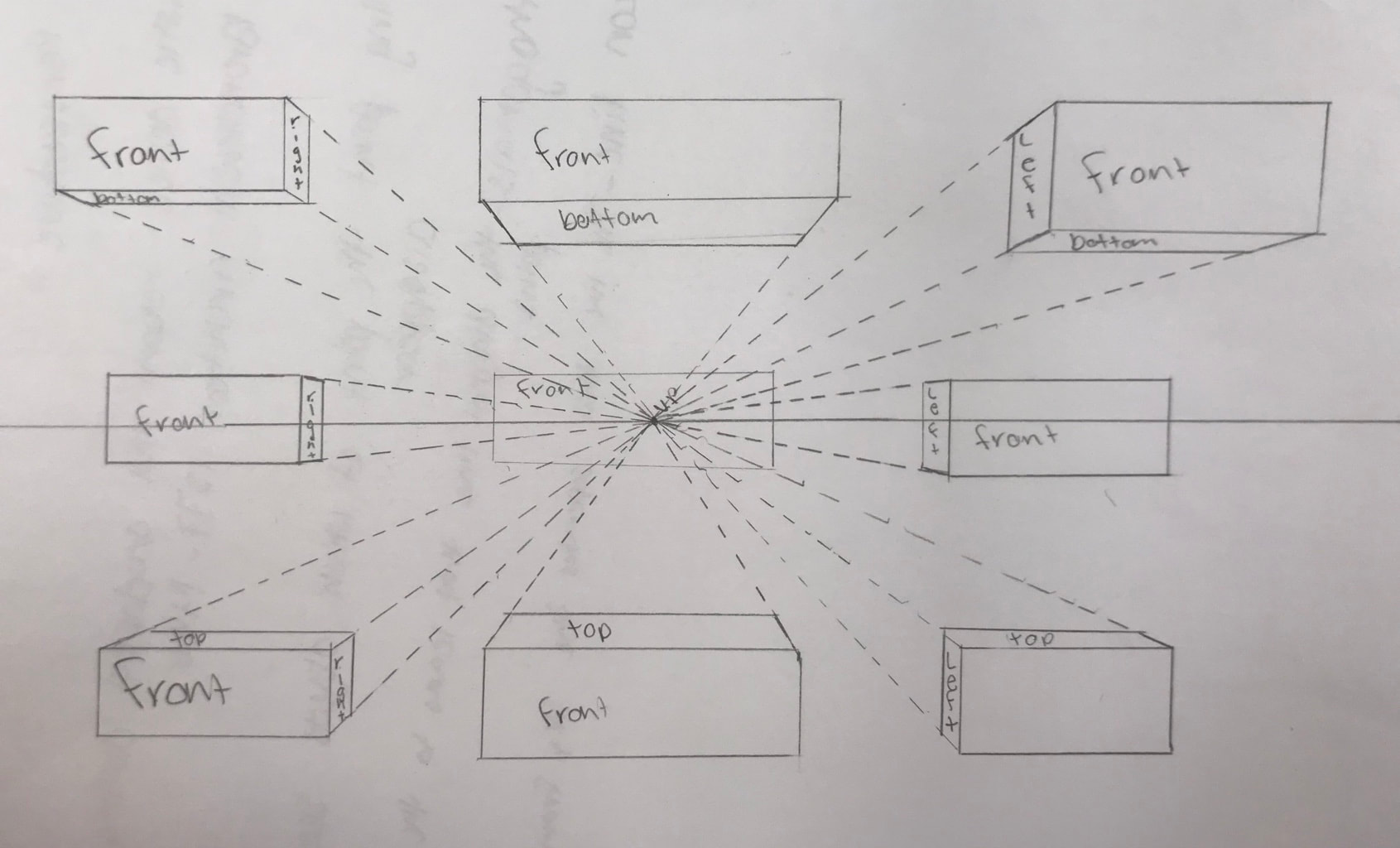
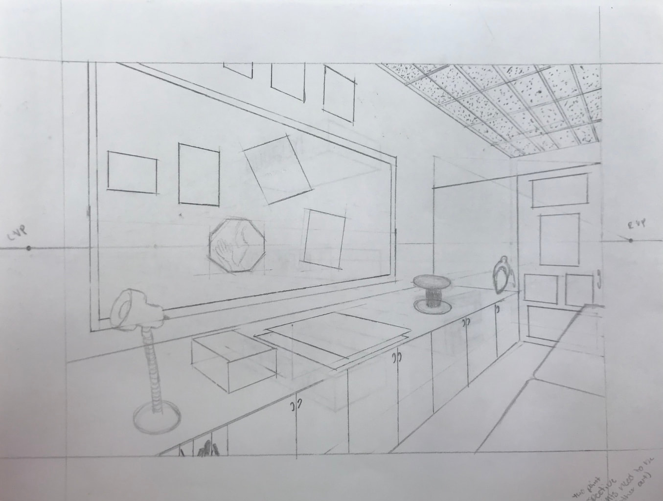
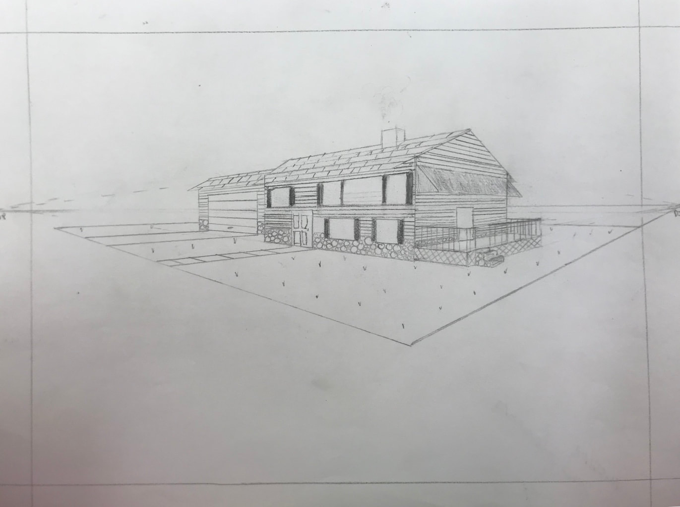
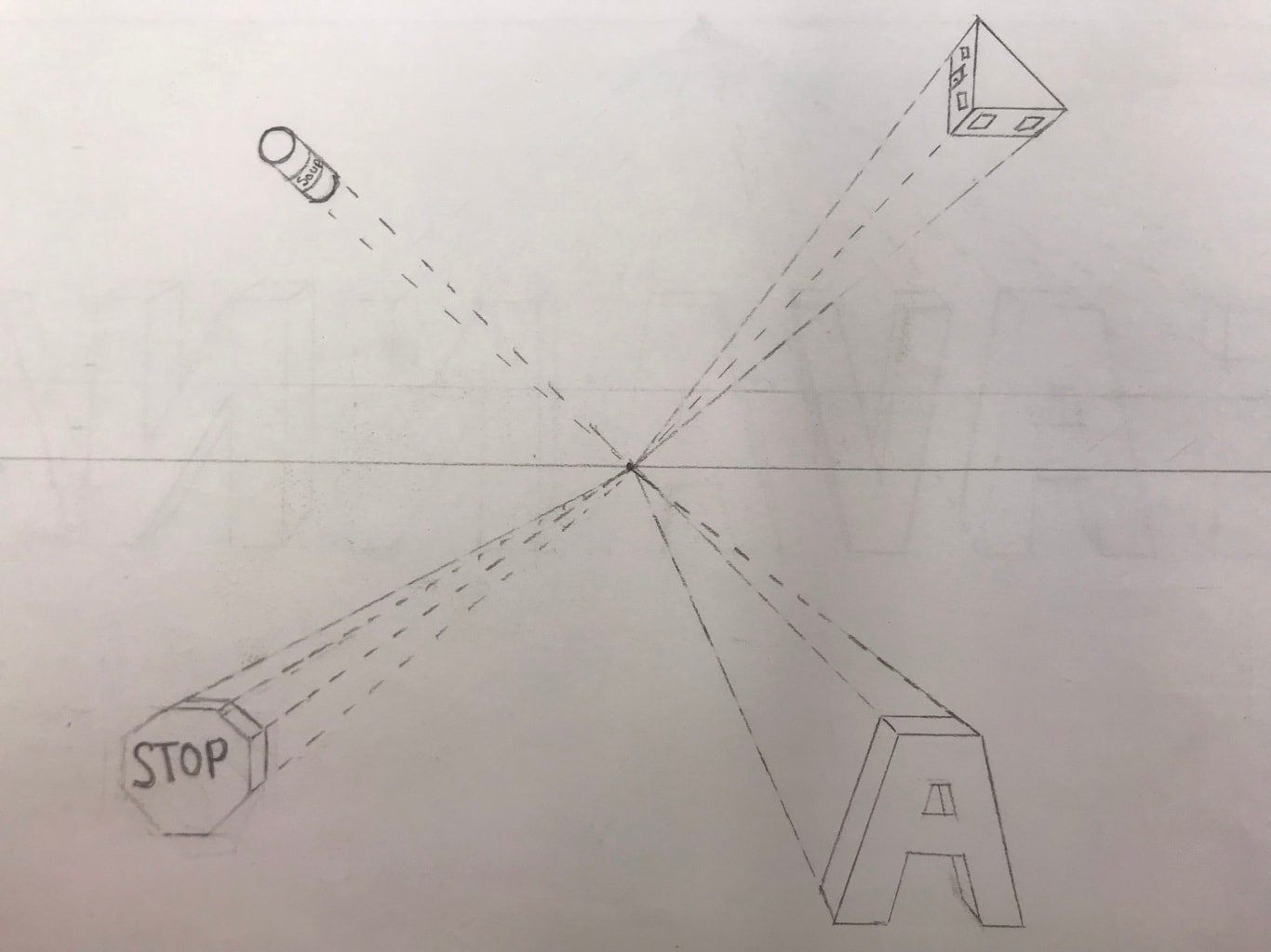
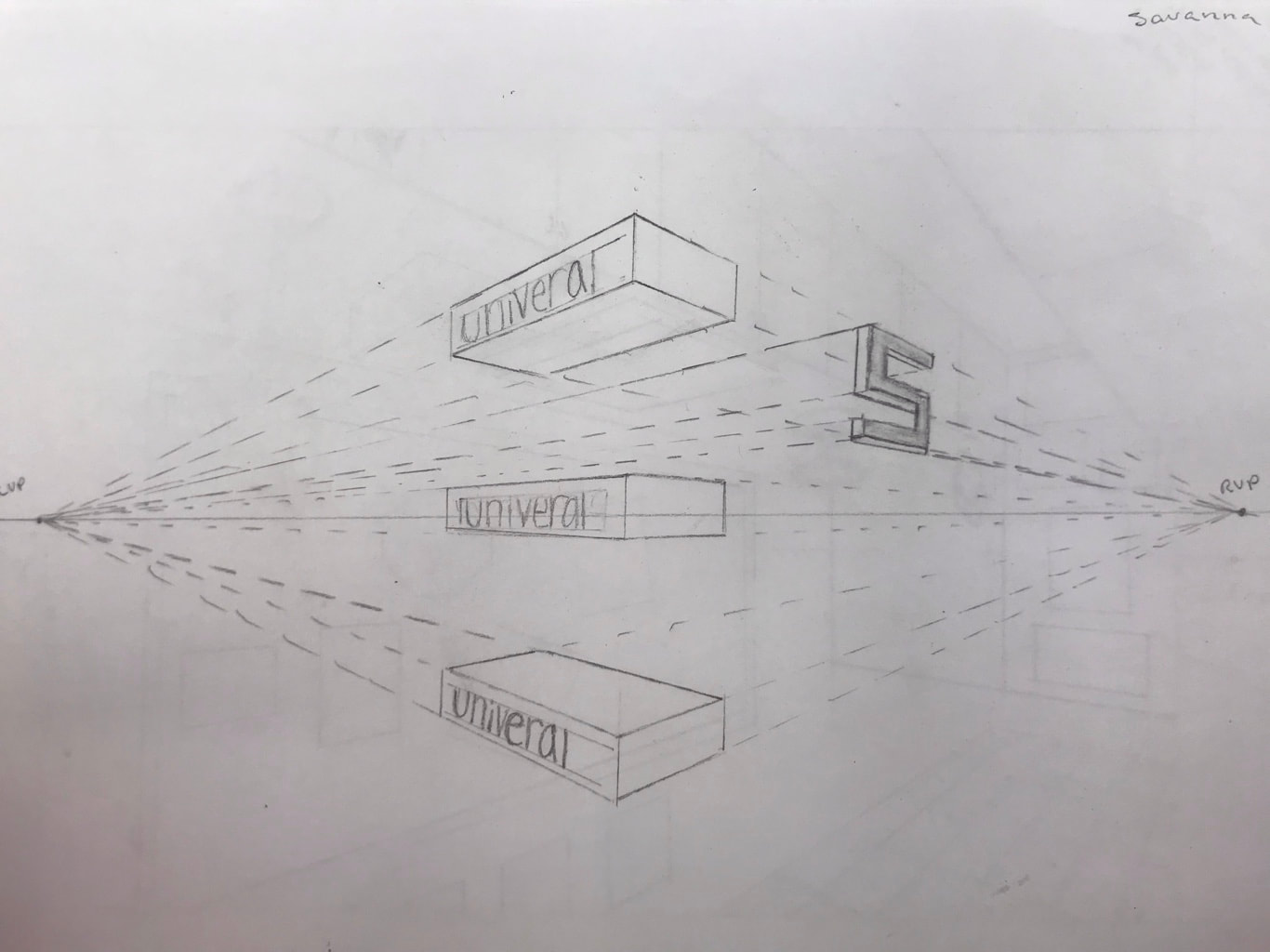
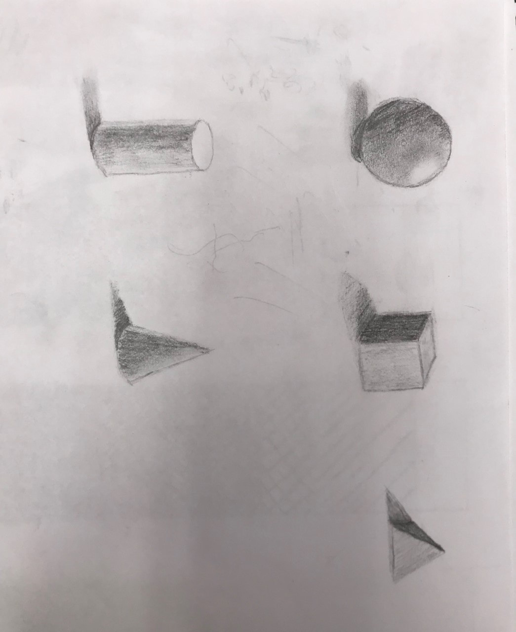
I’m understanding has definitely change, I understand now that when you put in the values into it, it becomes more 3D. I don’t exactly know where I struggle but I know I can still get better in perspective drawings.